BTD Weekly Update 09/27/2020 (unity webgl loading optimizations)
Play the not-at-all-finished game here!

Traffic Update
Last week’s post involved speculation of a pre-gameplay churn rate– the idea that players were leaving before BTD’s lengthy loading process had concluded. With improved analytics, the picture is now more clear, and it’s ugly–
 .
.
A frugal game needs to make an impression on every user who visits, and right now this is simply not the case with Life’s a Beach. The loading technology– technology that we plan to use on many subsequent projects– is simply too slow, causing most users to churn before even reaching the title screen. The above chart suggests a ~60% churn, which is far too high.
In order to optimize, we must identify where our bottlenecks are. In order to do this, our measurements and analytics must improve.
- We know how many people reach the page.
- We know how many people stick around until Unity Launch
- We know how many people stick around until the title screen.
In between these events, we can add–
- How many people reach the log-in screen?
- How many people click past the log-in screen?
There’s a chance our log in screen has a poor UX, causing players to churn. The introduction of these two events should help us understand if this is plausible.

^ This is not the most welcoming of login screens. Perhaps we should assume the player wants to play as guest, and simply launch the game?
By adding additional analytics events, we can narrow down what part of the pre-title-screen process is churning users.
Loading Time Optimizations
In the above loading screen gif, you may see something a bit unusual in the bottom-right corner– a user-facing loading timer–

Few commercial, released games will include something like this, and this isn’t surprising. Allowing a user to see exactly how long they’ve been waiting makes the wait feel longer, and puts an exact, objective time to the idea of “this game’s loading times are poor”. Should Life’s a Beach get to the point of widespread commercial release (and let’s hope so!), this timer will likely be disabled on anything outside of development builds.
However, one of the first steps in solving any problem is to understand it as deeply as possible. This is where measurement, analytics, and a bit of pride comes in. Considering the latter, it is incredible how quickly something improves once its sorry-state becomes visible. This is the true value of public playtesting– deficiencies become visible, embarassing, and (suddenly) worth the investment to resolve them!
Fortunately, there is an obvious first-step when it comes to optimization in the Unity ecosystem–
Process Technique : The Unity Profiler

The Unity profiler may be accessed via Window -> Analysis -> Profiler, and offers an in-depth view of your game’s logic and its consumption of time (among many other things).
As a quick example– note the two spikes in the image below (the cursor– white vertical line– is over one of them). These two spikes appeared nearly identical, and upon inspection revealed that the “InitializeDefaultProjectMetadata” function was being run twice! Why would we need to initialize the same thing twice?

Through the profiler image above (and the two nearly identical-looking spikes), I discovered a logical issue that caused us to do more work than necessary. Resolving this issue provided a small improvement in the smoothness of the loading screen.
Note : It is critical that you create standalone development builds for profiling, rather than relying on the Editor’s built-in playmode, as the Editor adds a lot of small slowdowns that can obfuscate where your game’s bottlenecks are. You may tell the profiler to analyze a running build, rather than the editor itself, via the button in the top-left of the profiler window–

Wasteful use of EncodeToPNG()
As an example, this week the profiler view helped me to notice that our Project Metadata Initialization Procedure (this is the logic that runs so we can get the game-specific loading background image and loading music, before the real loading begins) was causing stuttering due to its usage of the build-in EncodeToPNG() function. This was being used to cache the loading screen background image (a large 1920x1080 PNG) to disk in case the player wanted to play offline later. As it turns out, my logic had been… (1) Download the image, (2) Convert the data to a texture for usage, (3) convert the texture to a png byte array for storage to disk.
This logic, written quickly during a trip to Michigan’s oft-connectionless Upper Peninsula, isn’t flawed, but wasteful. We’re already downloading the PNG file, which means we have this file in the form of a byte array already, so why are we converting it into a texture, only to then convert that texture once again to a byte array? We already have the byte array, or we could not have created the initial texture! Correcting this logic provides a ~200ms saving during the loading process. It’s nothing too large, but correcting small issues like this begins to add up into seconds, and then tens of seconds. If we allow inefficient code like this to hang around, there is a chance it may find its way into more important systems down the line, causing further slowdown without our knowledge (this is not to say that you should prematurely optimize– wait until you have performance problems until doing this). Finding and correcting this issue took very little time due to the use of the profiler. It appeared to be a not-so-juicy bit of low-hanging, low-impact fruit, or so I thought…
I would later discover that this wasteful logic didn’t just exist in a one-off location dedicated to the loading background image– it existing in the very core of all image-caching in the entire loading process! Every single image downloaded to the game used this slow approach, and the penalty, as I would soon discover, was immense. I was using the same slow logic for my main, heavily-used image caching function (a function which gets run many times, and works with many large images to cache them for subsequent plays). The optimization, when applied in this far-more-impactful function, resulted in an immediate and absolutely enormous ~25% performance improvement (26 seconds on desktop -> 19 seconds).
When it comes to the startup times of Life’s a Beach, a brief analysis reveals a number of impactful factors–
AudioClip Processing Optimization : DownloadHandlerAudioClip.streamAudio
A large win was to set the DownloadHandlerAudioClip’s “streamAudio” setting. Setting this to “true” causes slower overall processing for each audio clip, but prevents the creation of an audioclip from blocking the main thread, allowing all audioclips to proceed at the same time, rather than sequentially (it also prevented the loading bar from stuttering, making for a much more aesthetically processed loading process).
This is an example of when parallelism, despite making each individual operation take more time, helped us to finish the overall job much faster. I wish Unity had this option for creating sprites!
Logging In : Cold Starts
Life’s a Beach has a server backend powered by AWS Lambda– a “serverless” platform for running code (in this case, C#). When a game client reaches out to our Lambda server, the server logic needs to be loaded onto actual hardware to execute, and this loading process takes about 6 seconds (with C#). After a few minutes of no activity / requests, Lambda will unload our server logic so that its hardware can run the logic of other AWS customers. This unloading process is part of what makes Lambda so cheap– we only pay for the time our server logic is running and responding to requests. If no one is playing our game (a near certainty in the early days), then we pay nothing. Unfortunately, this benefit comes with a drawback, as users must suffer a “cold start” if our logic hasn’t been used in a few minutes, causing the already-long loading time to extend an extra 6 seconds.
- A cold start cost 6 seconds.
- A “warm” start costs < 0.5 seconds.
We would like to have as many “warm” starts as possible, but we don’t have enough users yet to keep our backend server logic loaded 24 hours a day.
One solution is to use what AWS calls “Provisioned Concurrency”– an option that will force Lambda to keep our logic loaded at all times at the cost of…cost.

At an extra cost of $2.79/month to keep one instance warm, it is worth experimenting with. An EC2 server with this capability might cost $10-$30 monthly and far more in time spent on server maintenance.
Pre-Initialization Asset Download
If you look at the background of the log-in / loading screen, you’ll see a cool, game-specific background image asset–

(It’s a blurry photo of Brodio and his angry mob!)
If you listen, you’ll also hear a game-specific background audio loop. These two assets are unique in how they are loaded, in that they must be loaded BEFORE the loading screen can appear and commence with the heavy-duty load-every-character-and-tower-and-tile-and-menu-art operation. A consequence is that we cannot use the normal config loading system to load these files (the normal config loading system is what you see during the lengthy loading process). Unfortunately, these assets are not currently hosted via a super-speedy CDN like CloudFront, but via a random lambda function. (for those unaware– a CDN or content distribution network is a technology that allows you to cache your data closer to your customers, such that their downloads are faster and with better latency).

(project shortcodes mapping to various properties, such as loading_screen_url, in json format)
Storing this pre-load config data in Lambda has made it very easy to edit these pre-load assets, this incurs a cold-start in the same way as described above. In other words, it is currently possible for a user to encounter two cold starts, costing at least 10 seconds of the total pre-title-screen process. In fact, it should be expected that both lambda functions will be cold for most players due to how few users the game currently has. Nasty!
Fortunately, an easy, effective, and frugal solution exists– transfer the data from lambda to a cloudfront json file. CDNs are built to deliver this kind of content in milliseconds. As a result of storing this pre-load config in Cloudfront instead of Lambda, the pre-login times fell from 12 seconds to a much better 4-5.
The Made-With-Unity Screen
The “Made with Unity” screen costs us about 2-3 seconds per-launch, no matter what, but it may be costing us something more important. At $33.25 per month for removal, these seconds are some of the priciest we’ll be able to eliminate, and it might not be worth it… until one considers the reputation of this very logo– one scarred by asset flips, shovelware, and poor experiences. From the graph at the top of this page, one may see that handfuls of players each day aren’t making it past this screen.

(This screen scares some people)
The removal of this screen was probably the easiest optimization of this week, though not for my wallet– this decision has probably cost us 1 new Life’s a Beach character unit per month.
Optimized CDN Caching
Prior to this week, games stored their downloadable assets behind the arborpost.com website which, while powered by the CloudFront CDN, had been configured for constant changes and low caching. In a web-dev context, caching can make development and experimentation a frustrating process, as one can make a change to a piece of code or asset, only to be served with old cached stuff and wonder why nothing changed.
By moving production assets into a new site and enabling heavy caching, performance of each downloadable asset increased by x2 (took half as much time to download). Each game will have a development site where caching is disabled, and a production site where it is enabled for best performance.
This optimization step proved trickier than necessary, as some mistakes of mine weren’t realized until Chrome’s Developer Tools “Network” tab notified me that the game was still stubbornly using arborpost.com until I made some changes to how the game detects whether or not it is in a “production” location (lifesabeach.io) or a “development” location (arborpost.com).
Final Impact
The final cumulative impact of these techniques and changes is a reduction of the web full-load (no cache) time of ~50 seconds -> 22 seconds (cached load went from ~22 -> 18 seconds), with a loading bar that was much less choppy (much more professional looking). This appears to be a consistent win, with reports consistently in the 15-25 second range across a variety of semi-modern hardware. This is a massive win for UX, as ~20 seconds is enough time for someone to study the pre-loading art, enjoy the pre-loading music, and reach the title screen before boredom arrives in any way. This operation was a complete success, and we will need to pay close attention to the bail report in the coming weeks to understand if it has had the impact we hope for.
It is unclear if loading times are doomed to once again become a problem as our games get larger and more filled with high-quality assets. At some point, we may need to fundamentally change our approach from load-it-all-ASAP to a more common load-only-whats-needed-for-a-level approach, which is likely to scale far better, but will require a smarter asset architecture (how do we know what assets are needed for a particular stage?)
Log-In Page Friendliness
What if loading times aren’t the primary cause of our pre-title-churn problem?
My longtime friend (and former Halo Developer) Matthew Stone alerted me to the possibility that our current log-in page could be driving users away. I know that I have found it a bit intimidating in my own web gaming adventures to see a log-in screen so quickly. The idea of handing over an email, creating an account, etc when you just want to have some quick fun can be a big turn-off. Does the data suggest this could be a possibility?

If we look at the far right side of the bail report at the top of this post, we can see…essentially nothing. We have about one day of data on the topic of “how many people reach log in” (the purple line) vs “how many people left log in” (the orange line). On 09/25 we have 8 for the former, and 6 for the latter– we lost 2 people at the log in screen. While that isn’t much, it is a substantial portion of our daily players due to our lack of advertising. Sample size is going to confound any takeaways until we have more players, and we really need more data before we make any useful assumptions.
The log-in screen being an issue is a very real possibility. We’ll wait for more data before investing in experiments.
…But that doesn’t mean we can’t plan a little! Should we want to address the landing page / log-in screen, we will have several options.
- Make the “Play as Guest” button much larger and more inviting / prominent, making absolutely clear that players can get into it right away.
- Launch the game as a guest automatically (if a previous non-anomymous account isn’t detected). After upgrading characters for the first time, launch the prompt to convert account to a non-guest account to prevent loss of data). The largest issue with this approach is the situation in which an already-registered player cleared their browser web data, causing the game to register them as a guest– will they be able to find the “sign in” button in the settings? We would need to make a log in button prominent in the UI for guest accounts.
Web Page Optimization
Compare the Life’s a Beach web page with any other web-based game, and there’s a bit to be sad about –
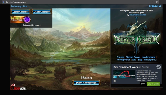
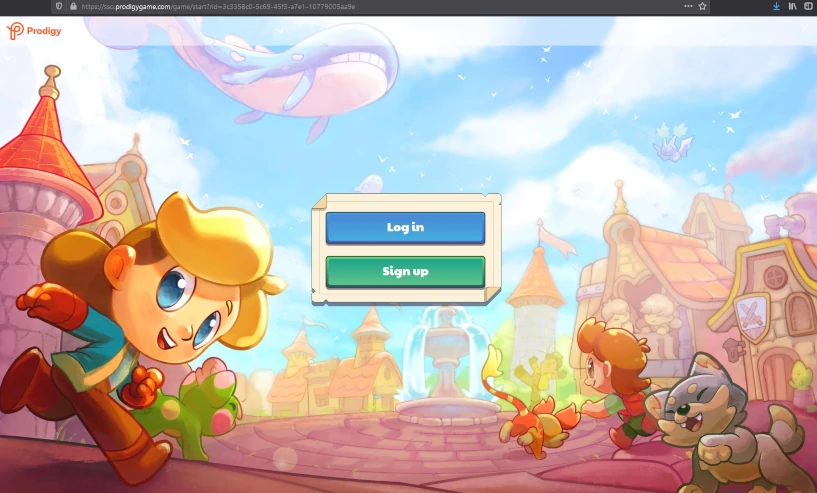


and now, look at the first impression that Life’s a Beach provides–
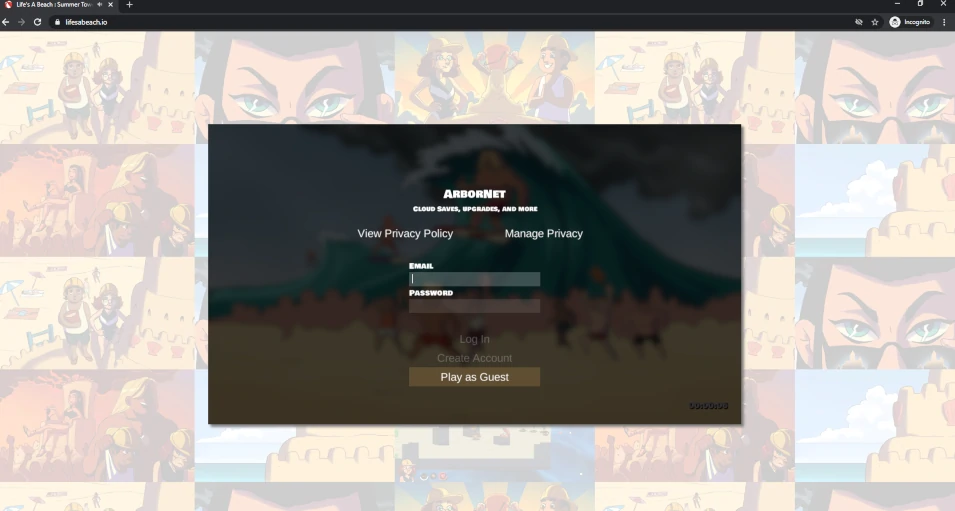
And this is after about 10 seconds on the page! During the first ~6 seconds, all the player sees is this–

Oof! If you play a lot of online games, this one doesn’t make a good first impression, and you couldn’t be blamed for bolting ASAP.
A few instant takeaways–
- Most web games have some sort of landing page before the game begins to load. I belive this may be for SEO reasons, as search engines are going to prefer lightweight pages that don’t have large games embedded in them.
- Most pages showcase their characters in some way. While Life’s a Beach sort-of does this with its faded background, the characters and gameplay are difficult to make out, and perhaps Shadia’s glare is scaring people!
- Often, there is some sort of instantly-visible logo or blurb that describes the game and what visitors are getting into.
While I do enjoy the simplicity of lifesabeach.io, this is not typical and the analytics are not currently positive enough to suggest this new approach is superior to a more well-researched one.
A few things we should be able to change in short-order–
- The empty black screen that appears needs to be replaced with a cool image (perhaps the title screen image?) during the period in which the Unity Player is loading. There are some games out there that do this, so I have confidence it won’t be a significant technical challenge.
- We should stop centering the game windows, such that it will be possible to add things to the top and bottom of the page in the future. It is common, for example, to place tutorial info, game descriptions, links, event splashes, leaderboards, etc below, above, or to the side of the game window.
Here are some quick experiments–
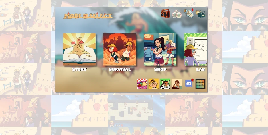
(raising the game window)
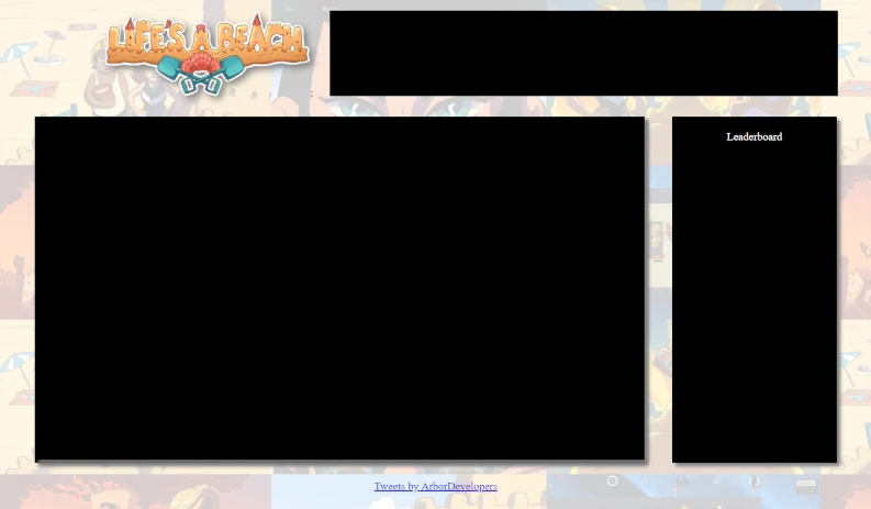
(moving the game window leftware and adding misc spaces above, below, and to the right of the game winow)
The top-right bar would be filled with an announcement, such as a clickable button to visit the dev blog, or an image that indicates a new seasonal event, a new content pack release, etc. The right-side vertical box would be good for a leaderboard, and we can always add things below.
Future Work
This week I hope to finish experimenting with a new layout for the page, introduce a functional leaderboard system, and gain more data to understand our pre-title-screen churn.
Subscribe to Future Devblogs!
Subscribe here to be notified when we publish future devblogs, tutorials, etc.
