Account-Flow, Landing Page, Progression, Leaderboards, (BTD Weekly Update 10/04/2020)

(^ This log-in screen is now delayed. Players no longer see it until 10+ minutes into the game. See the section far below.)
Play the not-at-all-finished game here!
Traffic Update
With all of the recent landing-page / loading-time investment, surely our pre-title retention rate has reached the moon by no–

Well darn. The data is not showing any clear positive impact yet. If we are to stay optimistic, we’ll need to identify more problems to solve. A few quick takeaways from this graph–
- The light-blue line (page visitors) isn’t doing much, which isn’t surprising. The number of people who visit the page wanes and waxes, but hasn’t significantly changed since we began implementing our pre-title screen optimizations (around 09/19) or so.
- The new “reached_log_in” data has had a few days to come in, and suggests that we lose ~2-3 people per day (~10-15%) when they see the log-in screen. With changes to account-creation-flow (discussed below) we will hopefully get those 2-3 people per day to the title screen, as they will no longer see the log-in page for their first ~10 minutes of game time.
- We had our best day ever on Monday 09/28 with 9 / 14 (64%) of our users reaching the title screen. This was followed by one of our worst days on Wednesday 09/30 with 1 / 10 reaching the title screen. It’s difficult to find a narrative (positive or negative) with such variance.
- The most users are lost, by far, in the period between the unity game starting (green line) and the player reaching the log-in screen (purple line)– a suspicious result, as this is a short period (2-3 seconds) following a longer period (6-7 seconds) and features the appearance of some nice art and music.
The latter bullet sticks out like a sore thumb, and merits additional discussion and investigation. Unless our analytics code is malfunctioning, players are waiting the 6-7 seconds for the unity game to launch, but are leaving quickly after, before the log-in screen can appear. I have three ideas on why this could be happening–
- The people who are finding our website tend to be curious enough to visit for exactly 6-7 seconds before churning. This idea is humorously specific, and probably not worth considering this week (though a larger discussion could be had about how marketing may be sending the wrong people to our site, though we aren’t doing much of it).
- The unity game begins, at which point they see Sam Olson’s beautiful artwork and decide it’s not for them. I find this a bit unlikely considering the quality of the artwork, and the fact that users can see a sample of it in the background of the leaderboard as early as 1-2 seconds after arrival on the page, and 6-7 seconds before the log-in screen appears.
- The unity game begins, at which point Leila Wilson’s fantastic music begins and the user decides to bail. I find this vastly more likely to cause churn, but not due to any issue in the music’s quality.
From my early days playing web games, and from friends who playtest, it is clear that people often play them in public areas, or while they have other music going on in the background, or while they are working at the office– various contexts in which music may be very unwanted. For this reason, Web games will often include a disable-music icon as early as the title screen as a result, and usually do not have music on the loading screen.
In our current form, Life’s a Beach does not give users the ability to disable / adjust audio output until the main menu, which for most players will be at least 20-30 seconds after music begins. In consultation with a few development friends, it is clearly something we should experiment with ASAP (providing a “disable audio” button as early as possible, at least in web builds.-
The Disable Audio Button
Motivated by the above data, we quickly created an experimental “Disable All Audio” button for the game’s loading and title screens–

This new button is one of the first things the player will see. Toggling it causes audio to turn on and off. Unfortunately, any interaction attempted during the loading process is likely to feel terrible due to how Unity’s loading-related functions cause freezes. Hopefully this lagginess doesn’t cause a bad first impression for too many people. Maybe when unity gets webthreading in a future version, this won’t be an issue.
As discussed in the section above, audio could be one of the largest issues driving player churn. Hopefully we see a noticeable improvement in the data this coming week.
Upgrade : Landing Page
- The game-area in th top-left now hops to life instantly, using a spinning icon to suggest loading. Compare this to what players used to see for ~5-6 seconds.
- The right side of the window now features a leaderboard area and a piece of Sam Olson’s fantastic character art in its background. Players get a small taste of the game’s quality art assets– something that should hopefully make them want to stick around. Seeing player scores pop to life in the leaderboard should also provide the feeling that the game is actively played and has a community.
- Many page elements now load much faster, providing a more responsive feel, as if the site is being maintained (which it is!).
- At the very bottom of the page, one can see an embedded twitter timeline. While a bit tacky, it should impart the idea that the game is being actively updated and worked on, as we announce all updates and devblogs via tweet. Come to think of it, I wonder what your average tower defense player would think about these devblogs, as they can get a bit technical at times, and they could certainly be seen as a bit “corporate” (these posts literally talk about how to get our players to stick around, have fun, and eventually fund through in-game purchases).
How did these ideas for change come about?
- Towards the end of the previous post, we examined other online web games to see how their landing pages were configured.
- 3rd-party web page analysis tools, such as google PageSpeed Insights provide an analysis and UX / usability score, along with many suggestions on how to improve page load times, responsiveness, etc. For PageSpeed, we were able to go from a mid ~60s (mediocre) desktop score to a ~90 (good) score by replacing large PNG images with WebP, removing CSS and javascript references from the html “<head>” section (allowing the page to render before everything loads), and making a few other tweaks.
This landing page, while unfinished (I would like to create an actual, game-free landing page at some point with splashy art, etc, and I would also like to commission some cool side-art) should hopefully move the needly a bit as we focus back on the game itself, rather than on how it is delivered. My hope is that, with these changes, even a mediocre game will be well-presented and thus enjoyable (though hopefully our game eventually transcends medicority!).
An interesting note before we switch topic– WebP (the new format we’re using to replace PNG images and animated GIFs) is not supported by Apple’s Safari web browser, which isn’t surprising, as Apple didn’t invent and doesn’t control the format. Fortunately, WebP support is slated for their next big OSX release (Big Sur), so Desktop safari users (all 8% of you) will enjoy an improved experience when that launches.
Leaderboards
New this week are the aforementioned leaderboards. The alure of competition is enduring and fundamental for us humans (and I would argue, for most things in nature). It’s no coincidence that twitch’s most-popular 20-30 games (as of 09/30/2020 at 1:26am EST) all feature signifiant multiplayer components (ok, maybe Hades and Mafia are exceptions in there).
We are not ready, from neither a design or technological standpoint, to implement real-time multiplayer to Life’s a Beach, so let’s foster competition with a simple but well-implemented leaderboard system. In this first iteration, the leaderboard displays scores for each player account, compiled every 5 minutes. Once the player logs in (and assuming their account exited at the time of the previous high-score compile), their account number will be highlighted in red, showing their place among the global scores–

One may scroll by clicking and dragging–
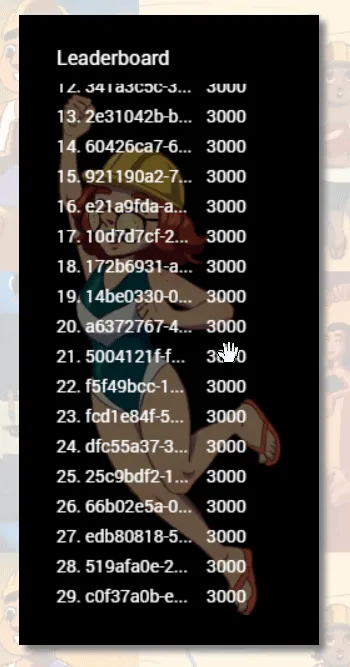
Just looking at these images, it should be obvious that a few things are sub-par. Your brain should be a little displeased.
- The text is a bit thin, and difficult to read on top of the background character art.
- Instead of displaying something natural, such as “Guest #”, all guest accounts are rendered as their actual player IDs, which are long and nasty in appearance.
- Most accounts appear to have the same score (3000)– an uncanny sight that makes it look like a bunch of bots have taken over.
The first two should be an easy fix– just add time. The third problem is a function of perhaps the game’s largest issue– the lack of any real progression system. Currently, a player’s account score is calculated by summing the amount of experience each of the player’s cards has accumulated, in addition to a 1000-point bonus for each card the player owns. This is not a thoughtful or deep method, made even worse by the fact that players can not meaningfully level up. The only accounts without a score of 3000 are some testing accounts. All new accounts, by default, begin with three cards provided to them for early battles.
The leaderboard will not be meaningful until the game’s largest (and perhaps most sensitive) hurdle is overcome– its lack of a progression system. It is somewhat irresponsible of me that I decided to focus on other things this week (why create a leaderboard before scoring is possible?). A recurring flaw of my character– scary things often get de-prioritized.
Still, I look forward to the leaderboard’s further development (likely a few weeks down the line after work on the progression system). Our use of HTML’s canvas element has given us a lot of control over how the leaderboard looks, and in what features it can have. I can easily imagine the leaderboard popping to life with juice when the player’s account “levels up”. Imagine the joy and satisfaction of clearing a stage, leveling up your characters, and seeing your account’s name and number lerp ever-upwards? Imagine the despair of seeing it slide downwards, falling behind those who are playing more often and more effectively? Ah, I hope our game can inspire that kind of emotion eventually.
Draft Progression System
High-Level Architecture
Hard-coding a progression system would be very fast (just make the number go up when something happens!). Sadly (long-term happily) we need to build out our progression system with flexibility and extendability in mind, as it is a technology we should expect to be used in many subsequent games. We would like our progression system should meet the following objectives–
- Flexibility : It should be possible to adjust progression from config (the online google spreadsheet).
- Cleanliness : The progression system should rely on consuming events emitted by other systems, rather than rely on other systems hardcoding themselves for progression system integration.
Here’s how the base implementation works in current iterations–
- the new ProgressionManager system subscribes to the EventEntityCreated, EventEntityDestroyed, and EventRankUpIntention events.
- When the former event publishes, the ProgressionManager registers a callback on the newly-created Entity’s “rank” datum. Should this rank value ever change, the ProgressionManager searches through all of the Entity’s statistics and recalculates those statistics that have a LUA progression function.
- The latter event (EventRankUpIntention) is consumed by ProgressionManager so it knows when the player has indicated they want a rank-up, after which it will check the entity’s inventory for the required rank-up items, and increase the entity’s “rank” integer datum if so. This, combined with the previous bullet point, causes stats to be recalculated when the rank integer changes, creating the expected effects of a rank up.
- EventEntityCreated and EventEntityDestroyed events are used to add and remove entities from progression tracking.
All of this should probably be in a UML diagram if we’re being honest, but I’ve never been a huge fan of UML, and am too busy to develop a taste for it. Maybe next week!
For those playing the game right now, the latest builds have the ability to rank-up units, but it is currently buggy and the progression system does not yet check for the necessary items, as the UI for it isn’t finished.
Choice of Progression Function

Progression functions are defined for individual statistics (hp, atk, spd, etc) within the game’s cloud config spreadsheet via LUA code, allowing us flexibility in how individual stats progress (see the highlighted cells in the image above).
The specific function chosen in this first draft iteration is a simple one seen in early RPGs, such as Pokemon generation 1.

- “n” is the current rank (an integer >= 1)
- “base” is the base value of that statistic for the particular unit.
What might look a little confusing at first turns out to be fairly simple. The division by 4 suggests that every 4 levels, the statistic will have increased by the value of “base” (the initial value of that statistic). Is this a good approach? One way to quickly size-up a system is to consider it at the extremes, and ask if it breaks. In the context of a progression system, imagine units at level 1 and units at a much higher level, say 30.
With this formula, the higher the unit’s base stat, the faster that stat will grow as the unit ranks up. This makes me a bit nervous at first, as it is an approach that looks like it will accentuate the strengths and weaknesses of certain units as they all rank up. Units with a high starting HP, for instance (Brodio), might grow their HP substantially faster than all other units, leading to potential runaway scenarios where they have absurd amounts compared to more well-rounded units at the same level. Fortunately, this is not the case. As units level up, they all gain stats at different rates, but the ratio of their stats will stay the same. At Lv. 1, Sandy has 80 HP to Brodio’s 250, a ratio of 32%. At lv. 30, Sandy will have 680 HP compared to 2125 for Brodio, a ratio of… 32%. This is a nice approach, as it allows our numbers to increase (satisfying), allowing units that are over or underleveled to feel the impact, while maintaining the uniqueness of each unit.
This first approach grows linearly, which should help us keep statistics from exploding and causing UI headaches.
Consider if we eliminated “base” from the multiplier. In this way, all stats would increase linearly by the same amount when a unit levels up, regardless of which unit type that is. Unfortunately, at higher levels the initial stat differences between unit types would become insignificantly small, causing each unit to feel the same– an effect we would like to avoid (particularly in a game with as little variety as this one currently has).
There are more exciting / interesting level progression systems out there. I hope to perform some more research this week, and hope to find some (I really enjoyed Final Fantasy X’s unique progression system).
Loading Screen Update
I couldn’t resist spending a small bit of time tweaking the loading screen. Some of my playtesters didn’t seem to be noticing the bouncing elipses in the last version, so now all the characters bounce!

I think some may see this as being a bit more childish / playful / cartoony than the previous iteration, in which only the ellipses bounced–

While I think both approaches work well, it is clear that we will need a new solution (perhaps several configurable “styles”) when we inevitably begin development on a less cartoony game.
New Utility Technologies
ArborUIManager : SimpleMenu()
If the player performs several unit upgrades while playing a guest account, they will eventually be greated by the following prompt–

The prompt above is pretty standard, and its basic structure can be seen in many game titles and software applications. The structure is this–
- One message (string).
- A list of buttons (List
).
Under the hood, a callback is needed for each button. Should the prompt be critical, it should also be possible to prevent a user from corner-exiting the window…

…and block other UI from being interacted with while the prompt is up. These are two features that can be seen in operating systems user interfaces. While the Arbor Interactive versions of these generic windows may not be very stylish (yet), they are highly functional, and make programming UI much faster than it would otherwise be.
The new SimpleMenu() function makes this prompt possible with just a few lines of code, from anywhere in the codebase for maximum ease of use (and just a little bit of spaghetti).
ArborPlayerPrefs : GetDateTime(), SetDateTime()
In Unity, there exists a very convenient, beginner-friendly sysem for saving data across game sessions– PlayerPrefs.
PlayerPrefs is a key-value store where developers can use ultra-simple functions such as “GetInt(key)” to get a stored int, or “SetString(key, value)” to store a string for later use. It’s a very simple, very effective system.
Unfortunately, Unity’s PlayerPrefs system has no cloud-oriented functionality. It does not provide cloud save sync by default. Arbor Interactive invested in a more advanced persistence system a few months ago, titled “ArborPlayerPrefs”. ArborPlayerPrefs has similar APIs to the base PlayerPrefs system (providing for ease-of-use) but makes the saves cloud-enabled by writing to disk and a cloud DynamoDB database whenever the user alters the data (with a time delay to prevent constant writes and server pings).
Beyond Cloud saves however, ArborPlayerPrefs has another great feature– it is created by us, and so we can easily add new functionality. This week we added a means to easily persist and retrieve DateTime datatypes. Semi-often, we wish to save a timestamp of when the player did something. One example from this week may be seen in the account_creation_prompt window show above.

In order to implement “remind me later” functionality, we need to store the last time the user was prompted, and retrieve that timestamp to decide if enough time has passed (in this case, I believe we re-prompt for account creation every 15 minutes or so. Don’t want users clearing their browser cache and losing their account). Serializing and deserializing Timestamps can be a little bit tricky, involving a handful of lines. The implementation of a standardized way to store and retrieve timestamps should hopefully cut down on bugs and improve our code’s clarity.
Account Creation Flow
I couldn’t go a single week without thinking of the pre-title onboarding process. With loading times largely solved (I consider <=20 seconds acceptable), the log-in / account creation flow became a focus. Essentially, we would like to delay the account-creation / log-in screen as long as possible to prevent unecessary churn, as users may be intimidated by an account-creation screen hitting them. Ideally, the account creation process happens when the user is invested, and knows that they would like to spend additional time with the game. The friction generated will be much easier for players to tolerate at that point.
Previously, the account creation / log in screen would appear as soon as the Unity game began running. Based on our analytics, nearly every single player who doesn’t churn upon seeing the login screen chooses to play as a guest at this moment. With this in mind,”the player wants to use a guest account” is more axiom than assumption. The latest builds create a guest account if it can’t find a registered one for the user, and the account name is now displayed near the player character

the user may then click on their username or the settings icon to find options for registering or switching their account–

Should the user continue playing for a while, they will receive occasional prompts informing them of the benefits of registering their account.
In other words, players’ first experience of the game should be less F2P-y, and more that of a traditional premium game or classic web game. As far as initial impressions go, I feel we could do more to establish the basic theme / narrative in a cutscene between the loading screen and title, or perhaps the title and menu. The awesome intro from Lord of the Rings : Return of the Kind comes to mind–
If this game doesn’t detect a save file on the local device, it will launch not to a menu, but straight into some epic cutscenes, then into a tutorial gameplay sequence! I remember finding this epic and engaging as a child the first time, but annoying on subsequent playthroughs. I’ll need to include some sort of skipping functionality for players who just want to log in, sync their data, and continue their adventure.
As far as what we would show, a couple of animatics could show Shadia’s first reign of terror coming to a head as she uses her newfound platform and media dominance to whip up an angry mob and chase away her foes. Perhaps after a few animatics the player would assume the roll of these victims as Shadia’s army crashes down. The player would have a few high-level towers, some intro tutorials, and then would be placed into an endless survival round, ending when the player is KO’d, followed by a few slides of Shadia taking over the campus and beginning her reign. Say something like “2 years later”. Cut to title, and assume the role of Sandy just trying to make her castles. “What’s wrong with making castles?”
Future Design Tweak Speculation
On the topic of lives and the current challenge, I like the idea of consequence– you may play through a randomly-generated map, but if you want to finish it and unlock a new chapter you need to prepare and be careful in your decisionmaking. Currently, if the player plays a stage that turns out to be too difficult for them currently, the player gets booted out and must repeat the stage from get-go, losing all progress through that stage, with only the items they collected being retained as their “progress”. I think this is too punishing. Even when a player loses, they should feel a sense of progress, even if the outcome is sour. I am considering the following design changes on the topic of death. When the player dies during a stage–
- They get the choice of leaving the stage (resetting it).
- They get the choise to continue the stage on their next life, reverting to the previous round break with all their towers persisting and 30 extra currency.
These can work as new buttons on the continue screen. As this choice is likely to be an upgrade on the existing approach, we will commence experiments in a future week.
Community News
Michael Siciliano (Jackbox Games) talks Indie Survival and Jackbox History

Michael Siciliano (bottom), a former Wolverine (and assistant of my eecs494 class) and Jackbox Games engineer, presented at <a href=”https://igda2.org>”IGDA Ann Arbor</a> on the topic of Indie Sustainability and the success / history of Jackbox Games. He also discussed the Jackbox development process and why it works so well in the context of Jackbox’s business model. A true inspiration, the community owes Michael a great deal for his time this month! Check out his portfolio here!. Watch his IGDA Ann Arbor presentation here!
Kickstarter Launch ~ Nochi Studios presents : Somnium Eleven

With their previous game successfully kickstarted and launched, Ann Arbor’s Nochi Studios has unveiled a new kickstarter campaign for Somnium Eleven, “a choice-driven, magitech isekai visual novel” full of romance and social-media-based mechanics! With incredible art and character design, I had no choice but to back them, and I hope you will consider it too!
Gaudium’s Grand Alliance Succeeding on App Stores

Grand Alliance a new CrunchyRoll-published, Ann Arbor-developed mobile RPG has earned 550+ reviews and a 4.0 rating on the Google Play Store, making it Crunchy Roll’s second-highest-rated game, and third most-popular. A big congratulations to the game’s local developer, Gaudium, as their hard work appears to be paying off. You may download the game on the google play store (Android) or Apple App Store (ios) today!
Future Work
This coming week I hope to invest more time in finishing the progression system, followed by a sprint to make gameplay more varied (new tower types, projectile types, unit types, etc)..
- The desktop-downloading UX is sub-par. The player downloads the desktop executable, then discovers that they must traverse through 4 levels of confusingly-named folders in order to reach an executable titled “win_build” instead of “Life’s a Beach”. It’s a sorry experience. How many players are using the recently-provided desktop builds?
Subscribe to Future Devblogs!
Subscribe here to be notified when we publish future devblogs, tutorials, etc.